Principle 4:
Congruence
22 September 2019
The 7 Principles of Conversion-Centered Landing Page Design: Congruence
Congruence: The fourth principle of conversion-centred design.
“Getting an audience is hard. Sustaining an audience is hard. It demands a consistency of thought, of purpose and of action over a long period of time.”
– Bruce Springsteen
And that, dear friends, is why congruence in your campaigns is critical.
Consistency and balance helps you build an experience that speaks directly to your customers, because every element on your page is aligned to the single goal of your campaign.
Master congruence, the fourth principle of conversion-centred design, and you’re one step closer to converting users much more effectively.
Disclaimer: if this is the first time you’ve heard of CCD, this blog won’t make much sense. This is where you need to start.
How to grade your landing page on Congruence
Open a sexy spreadsheet and put all of your content (even your image descriptions) in there.
This lets you dissect your content without getting distracted by fancy visuals, allowing you to look objectively at every word you include on your landing page.
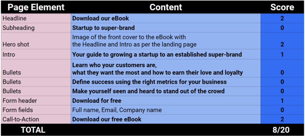
Your spreadsheet should look like this:

See how we’ve scored each element? We’ve assessed whether or not the content could easily be connected to the campaign goal – Download our eBook – and graded it appropriately.
The scoring works like this: if the content is congruent with the campaign goal, it gets two points. If the connection is weaker, it gets one point. No connection at all? Nil points.
Eight out of 20 isn’t ideal, so there’s lots of room for improvement. If you do this exercise and get an even lower score, see it as a win! Because now you know what needs changing to ensure your content harmonises beautifully with your campaign goal.
Here are a few tips to help you eliminate incoherence and ooze congruence:
– Identify the keywords for your offering, such as ‘free eBook for startups’ or ‘register for our event: Digital Transformation – Improve Your Visitor Experience’
– Ensure your main keywords are included in your content but play around with the word order so you don’t sound like a broken record
– Include a hero image that relates directly to your offering, like this:

Source: Venminder
– Remove any links or content that doesn’t link to your campaign goal (you might have already done this when applying the principle of attention, but this is a great opportunity to check again).
– The content on your landing page needs to echo that of your advert. For more tips on how to do this, read our blog on context.
Use these pointers and your landing page should get a much better congruence score, helping you increase those click-throughs for campaign glory.
But it’s not just your landing page which can benefit from good congruence…
Your website needs congruence too.
Like all the other principles of conversion-centred design, congruence also optimises your website, so you can engineer you customer’s online journey as soon as they land on your web page.
Software development company Unbounce recently did an experiment to demonstrate how congruence can affect website visitors completing a desired action.
It wanted to ensure users who found the article “What is a landing page?” on Google would visit its free templates page to move prospects along the customer journey more effectively.
The first thing they did was to remove all content links and the sidebar navigation. This follows the rule of attention, the first principle in CCD. By eliminating distracting SEO-based links throughout the content, Unbounce lowered the page’s attention ratio significantly (it was originally 49:1 with the foot navigation).
The next step was improving the page’s congruence. This was done by adding a CTA button linking directly to the free templates page. The CTA’s content included the main keywords in large font to ensure users knew exactly where that button would take them.
Unbounce then measured the page’s visitor engagement. It found that by removing these distractions and adding a relevant CTA button, visits to the free templates page increased by a staggering 172.1%. Not bad, huh?
Congruence is influence.
Can you now see how valuable Congruence is? By completing this essential step in conversion-centred design, you gain the power to influence your visitors’ actions. With increased control over your landing page or website’s engagement, you will improve the results of your campaigns and drive conversions.
We’re not done yet…
Next up in our CCD series is credibility. This is how you earn commitment from your customers and trust from your prospects. Our next blog will teach you how to make your campaign goal as enticing as a swimming pool in the Sahara through enhanced credibility on your advert and landing page.